Creating a color palette is no easy task, but expert advice from Betts and Co is here to save the day! Betts and Co teach us how to create the perfect color palette for any season. The sky is the limit, from springtime pastels to vibrant summer colors, deep tones for fall, and neutrals for winter. In addition, we also dive into the essential element of texture and how to use it throughout the design to create a cohesive and upscale look. We’re talking all about pulling inspiration from wallpaper, patterns, and artwork instead of taking inspiration from common places like Instagram and Pinterest. Betts and Co show us how easy it is to create unique and stylized palettes that will surely bring the wow factor! Don’t miss all of Betts and Co’s tips below.
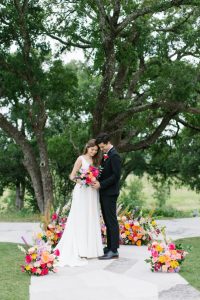
Describe this wedding scene.
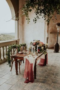
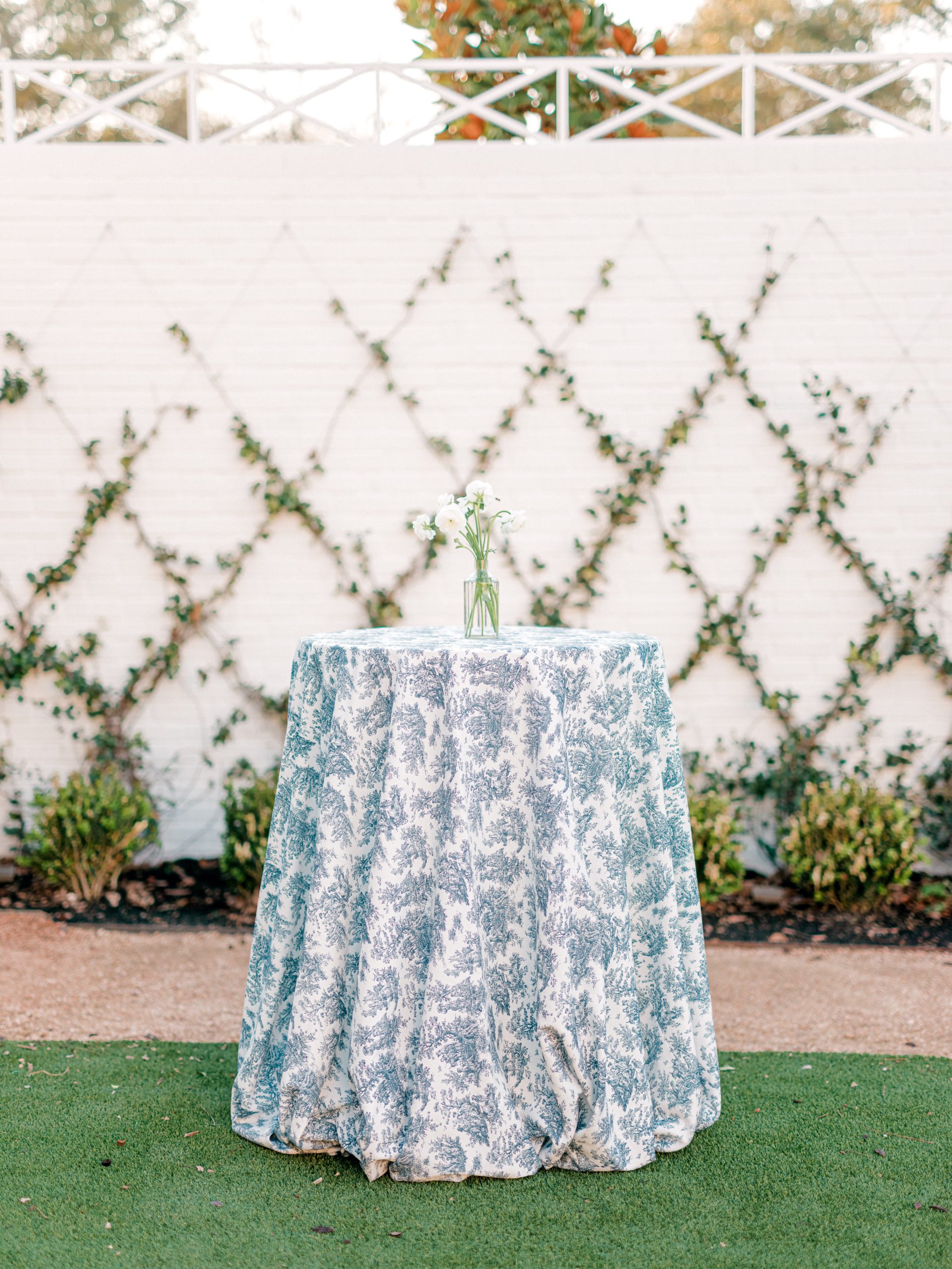
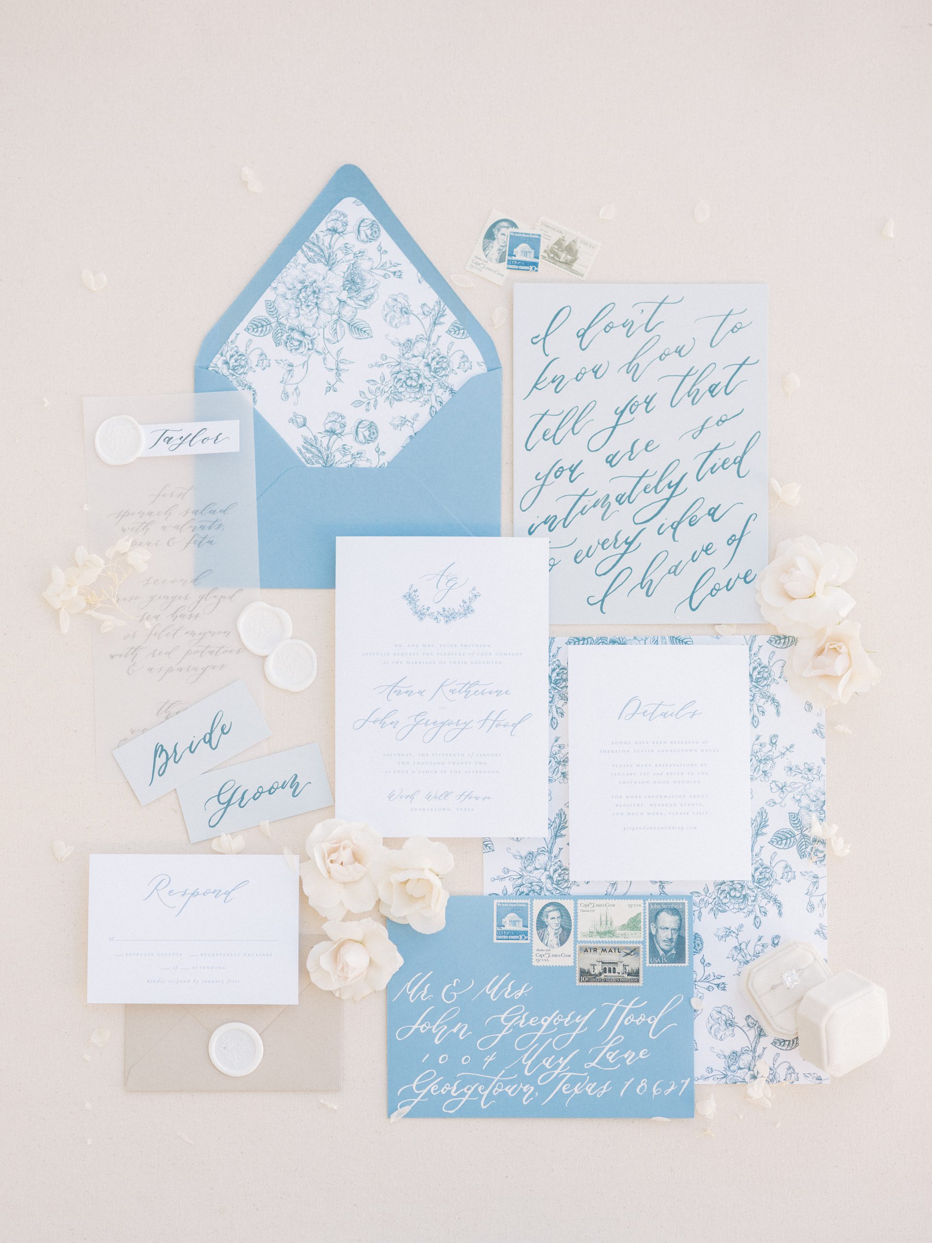
Toile is a fabric seen through European design, which was the cornerstone of the vision for this shoot. I focused on blue toile complemented by beige, white, and green to create a French-inspired atmosphere. Furthermore, in this design, I added accents of gold and stone.
What should a couple consider when choosing a color palette for their wedding?
The time of year is significant. With spring time I’d suggest focusing on pastels and brighter colors. I’d focus on warmer, more vibrant colors like a bright pink peony for summer. I’d recommend using warmer, deeper tones, such as terracotta, in the fall. Finally, for winter, I’d focus on more whites and neutrals. All that said, you can get away with a traditional all-white wedding with greenery and hints of neutrals any time of year! Another important element aside from the color palette to consider is the texture. For example, you can focus on velvet throughout your design in the fall and winter months, but I would not suggest this texture for a tablecloth in the spring or summer. Instead, I’d recommend more natural linen like a Panama from Premiere in warmer months. Another popular year-round linen is anything satin or Dupioni (elevated, textured silk).
What tips do you have for working with your florist, stationery, rental company, etc., to achieve your design vision?
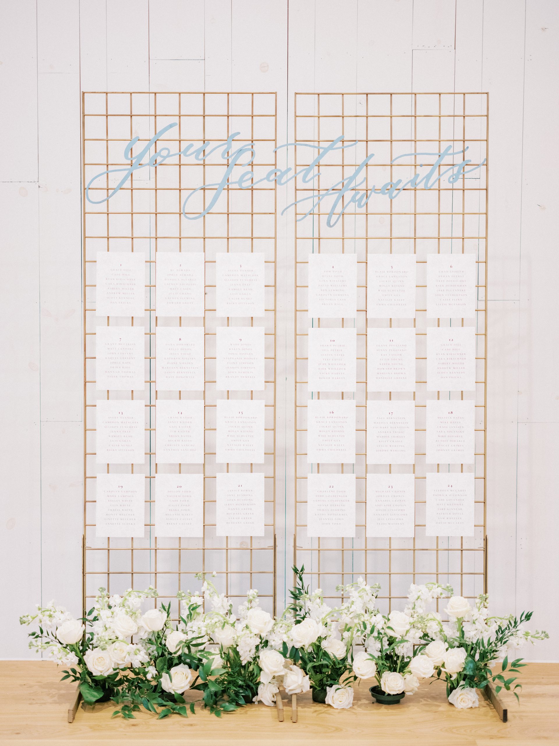
A design board and proper renderings are crucial to communicating your vision to vendors. You might see that there is a photo you like where you love the table linen, but you’d prefer a more modern chair and taller florals. Then we would create a rendering for you with the table linen you like, chairs, and floral that way, each vendor has a visual rendering of how to bring your vision to life, similar to an interior designer or an architect.

What are your favorite color palettes to use in weddings right now?
At the moment, I love an array of pastels giving a springtime feel. With that said, I always lean toward classic palettes of primarily white with a hint of an accent color like a springtime pastel.
It’s so easy for couples to want to recreate weddings they see online. How do you encourage them to design an event that’s uniquely them?
I tell my couples not to take all their inspiration from Pinterest, Instagram, and past weddings. Instead, I encourage my clients to pull inspiration from wallpaper, patterns, and artwork they love. Or rather draw inspiration from the space itself. For example, if a venue has a garden with florals of a specific palette, we would pull inspiration from that. For this particular shoot, I pulled from the toile, blue fabric design and brought it to life through the design!
Other Local Vendors:
Betts And Co, Feathers And Frosting, Sarah Tribett Photography, Sunny Hair And Makeup Artistry, Capra Cavelli, Jen Krause Paper Co, Melange Bridal, Nuage, Peerless, Wild Poppy Floral, Wish Well House